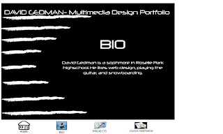
Below are my web pages. i chose the black and white color schem because it stands out the words are easy to read and it looks cool. i chose the font neuropol because i thought it was easy to read but still fit the theme. also i put the lines on the side to fill in some space and also to give a constant general theme. For my icons I put pictures representing the pages and what the actual links are underneath the icons. also i titled all my pages with what they are to make it easier to surf through the website.


No comments:
Post a Comment