Friday, November 19, 2010
Website Pages
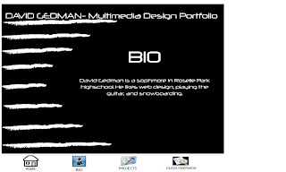
Below are my web pages. i chose the black and white color schem because it stands out the words are easy to read and it looks cool. i chose the font neuropol because i thought it was easy to read but still fit the theme. also i put the lines on the side to fill in some space and also to give a constant general theme. For my icons I put pictures representing the pages and what the actual links are underneath the icons. also i titled all my pages with what they are to make it easier to surf through the website. 

Thursday, November 11, 2010
Tuesday, November 2, 2010
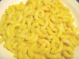
step 1: firstof all i found a picture of a pool then i useda layer mask to erase parts of the macroni i didnt want.
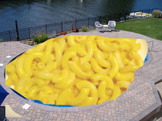

step 2: next my partner drew added put yellow around the macroni to blend it in and used to blurr tool to fix it up lastly he put a car in the pool to make it look like its sinking.
step 3: for this step i found a picture odf a guy on top of a car and used layer mask to edit it in. 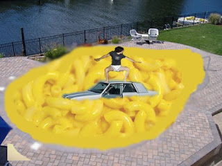

step 4: lastly my partner drew got a picture of a guy with his head on fire and used a layer mask to edit it onto the guys face.
Subscribe to:
Posts (Atom)


