Songs used:
pursuit to happiness-kid cudi
open happiness-Cee lo green
i am telling you-jennifer hudson
the first song i used was a clip from "pursuit to happiness". then i used the song "open happiness". lastly i used the song "I am telling you".
Thursday, December 23, 2010
Wednesday, December 1, 2010
rollover button
to make a rollover button/link on dreamweaver theres a few things you have to do. First of all you have to make your button/link on illustrator of what it looks like before you roll over it. Then you make the button/link of what it looks like when you do roll over it.
Now you go onto dream weaver and click the "Draw AP Div" button and draw a box whereyou want the button/link. Then you go to the common tool bar and click on the "image" button and select "rollover image" then click the browse and select your before and after image then click "OK".
Now you go onto dream weaver and click the "Draw AP Div" button and draw a box whereyou want the button/link. Then you go to the common tool bar and click on the "image" button and select "rollover image" then click the browse and select your before and after image then click "OK".
BEFORE
AFTER
Friday, November 19, 2010
Website Pages
Below are my web pages. i chose the black and white color schem because it stands out the words are easy to read and it looks cool. i chose the font neuropol because i thought it was easy to read but still fit the theme. also i put the lines on the side to fill in some space and also to give a constant general theme. For my icons I put pictures representing the pages and what the actual links are underneath the icons. also i titled all my pages with what they are to make it easier to surf through the website. 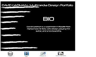

Thursday, November 11, 2010
Tuesday, November 2, 2010
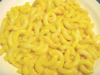
step 1: firstof all i found a picture of a pool then i useda layer mask to erase parts of the macroni i didnt want.
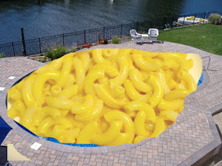

step 2: next my partner drew added put yellow around the macroni to blend it in and used to blurr tool to fix it up lastly he put a car in the pool to make it look like its sinking.
step 3: for this step i found a picture odf a guy on top of a car and used layer mask to edit it in. 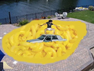

step 4: lastly my partner drew got a picture of a guy with his head on fire and used a layer mask to edit it onto the guys face.
Thursday, October 28, 2010
PHOTOSHOP_combination
PHOTOshop_maganetic lasso
PHOTOSHOP_layer mask
 i used alot of different methods to create this photo of a plane crashing into a pool. first of all I got a picture of a pool that I liked. Then i found a plane that looked like it would fit right . Then I put it in the pool and added a layer mask and got rid of the front of the plane. Next i used the blurr tool for the front so that it will look more realistic. finally in put the flames and smoke on the plane, and added another layer mask and got rid of the parts i didnt want.
Thursday, October 14, 2010
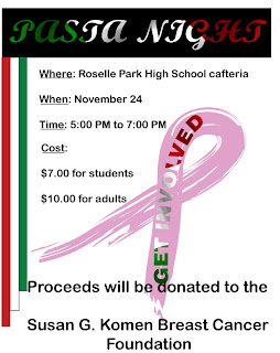
To make my flyer I used many different principles and elements of design. First of all I make a clipping mask, I went on Google and got a picture of the Italian flag then I copy and pasted it on illustrator then I wrote the words “PASTA NIGHT”. After I made the clipping mask I put it on top of a black background. The next thing I did was make three rectangles each one shorter than the other and made one green one white and one red. Then I had those rectangles run along the left side of the flyer. Then I made a big pick breast care awareness ribbon and made another clipping mask of the Italian flag that said “GET INVOLVED” i then put the "GET INVOLVED" on top of th pick ribbon combine them and made it bigger for the background.
Wednesday, September 29, 2010
ILLUSTRATOR: type on a path name
ILLUSTRATOR: type on a path mmd
ILLUSTRATOR: snowflake

For this awesome shape it took alot of work. First of all i put a hexagon on the page. Then i copied it and made another, after that i turned the one a little bit and put it on top of the other one making a star looking shape then i combined them. After that i made a long skinny rectangle and placed it on the star shape at 90 degrees. Then I highlighted the shapes and clicked "subtract" and it deleted the rectangle and left an empty space between. After that i repeated the process 4 times turning the rectangle a little bit everytime.
ILLUSTRATOR: clipping mask name
Tuesday, September 28, 2010
ILLUSTRATOR: combining shapes
ILLUSTRATOR: clipping mask
Monday, September 20, 2010
Welcome!
Hi! My name is david gedman and i will be using this blog a a portfolio for my multimedia design class. i will be posting my projects and examples along with a brief description of what i did. Please check back to see my work!
Subscribe to:
Posts (Atom)


